Stanford Machine Learning Class

stanfordml

For the past 5 weeks I have been doing the Stanford Machine Learning class offered by Coursera. In the past I have started and stopped taking the class but this time around I am fully committed and now into week 5. I’ve learned so much so far. I have always used functions like logistic regression in R and understood a little about how it worked down to the sigmoid function however this class has really given me an appreciation down to the linear algebra that is happening under the hood. The neural networks section has also been revealing. I had always assumed neural networks to be unapproachable however so far the class is doing a great job of breaking it down. I have now applied a neural network from scratch using linear algebra in Octave.

This is definitely a great value for the material and quality of the videos and exercises. I decided to do the certificate version because to me this is a core curriculum class in my MOOC journey. I still have quite a few more weeks in this class however I’m already looking to the next one which will probably be the Caltech EdX Learning from Data Class.

While I am used to python, matlab, and R my initial reaction to Octave has been a little mixed. While it was incredibly easy to grasp the syntax the submission portion of all the classes has been plagued with coding errors. I had to search stack overflow until I found the correct fix. Also I had to install version 4.2.0 and not all versions of Octave worked. I understand the reasoning for choosing Octave though as R does have some data type issues for those new to it and the focus is really on the math not the coding syntax. Also matlab isn’t really an open source nor cheap option for most. Overall I’ve been very happy with this course. I think the presentation and exercises complement the John Hopkin’s Data Science courses and should be taken after the fundamentals of those classes are complete.

An Analysis of the Flint Michigan Initial Surface Water Corrosivitiy

An Analysis of the Flint Michigan Initial Surface Water Corrosivitiy

Part 1: Start at the Source

Introduction

As many have heard recently residents of Flint Michigan have been rightly outraged due to the high presence of toxic chemicals including lead in their drinking water. The question arises how did this occur and was it a forseeable incident? The backstory that led up to this incident can be generalized into a few main chapters.

  1. Flint had long sourced their water from the Detroit Water and Sewerage Department (DWSD)
  2. The city had financial incentive to reduce spending because they were under financial stress
  3. Flint went into an agreement with the Karegnondi Water Authority (KWA) and their to be completed source from Lake Huron(end of 2016)
  4. The existing supplier DWSD provided their 12 month notice that their supply contract would end on April 2014
  5. The flint river was relied on to supply water in the interim
  6. The flint river contained significantly higher levels of chloride than the Detroit water source and no anti-corroding agents were applied

Hypothesis

In this analysis we will utilize Census Data as well as US Geological Wate Quality Survey Data to analyse the Flint incident starting at the source pre-treated water as well as nearby streams in Detroit and near Lake Huron. It is not meant to serve as conclusive evidence of any kind. We will be looking specifically at chloride concentrations to see if Flint, Mi has very corrosive water to begin with.

Before we begin let’s check for and install any necesary packages for this story

setwd("~/DSTribune/Stories/FlintWaterQuality")
library(ggplot2)
library(dplyr)
## 
## Attaching package: 'dplyr'
## The following objects are masked from 'package:stats':
## 
##     filter, lag
## The following objects are masked from 'package:base':
## 
##     intersect, setdiff, setequal, union
library(xtable)

The city of Flint is located in Genesee County and this is really a story of three counties. Detroit, Wayne County that originally sold treated water from multiple rivers including the Detroit River to Flint as well as the KWA plant [under construction sourcing water from Lake Huron] (http://www.nytimes.com/2014/05/26/business/detroit-plan-to-profit-on-water-looks-half-empty.html?_r=0) located in Sanilac County.

We will download fresh water data from those two counties and merge them into one data frame

#Genesee (Flint)
temp <- tempfile()
download.file("http://waterqualitydata.us/Result/search?countrycode=US&statecode=US%3A26&countycode=US%3A26%3A049&sampleMedia=Water&characteristicType=Inorganics%2C+Major%2C+Non-metals&characteristicName=Chloride&mimeType=csv&zip=yes&sorted=no", temp)
wqGen<- read.csv(unz(temp, "result.csv"))
wqGen$County = "Genesee"


#Wayne (Detroit River)

temp <- tempfile()
download.file("http://waterqualitydata.us/Result/search?countrycode=US&statecode=US%3A26&countycode=US%3A26%3A163&sampleMedia=Water&characteristicType=Inorganics%2C+Major%2C+Non-metals&characteristicName=Chloride&mimeType=csv&zip=yes&sorted=no", temp)
wqWayne<- read.csv(unz(temp, "result.csv"))
wqWayne$County = "Wayne"


#Merge the three County Water Measurements
wqDf <- rbind(wqGen, wqWayne)

#Save an offline version of the merged county water data
write.csv(wqDf, file ="MI3CountyCountyWaterData.csv")

We filtered our data for high quality measurements only taken at the surface. We specifically collected data on dissolved chloride concentrations because chloride ions are the key element in contributing to the corrosion in Flint pipes leading the leaching of metals such as lead. In the second half of this story we will also cover how the addition of chlorine escalated chloride concentrations but for now we will focus on pre-treatment water quality.

wqDf <- filter(wqDf, ActivityMediaSubdivisionName == "Surface Water", ResultSampleFractionText == 'Dissolved', ResultStatusIdentifier == 'Accepted' | ResultStatusIdentifier == 'Final' | ResultStatusIdentifier == 'Historical')
wqDf$MonitoringLocationIdentifier <- as.character(wqDf$MonitoringLocationIdentifier)
wqDf$ActivityStartDate <- as.POSIXct(wqDf$ActivityStartDate)
wqDf <- wqDf %>%
  filter(ResultMeasureValue != "NA")

We now would like to see if there is a significant difference in pre-treated chloride concentrations amongst the two counties.

#What we want is a percentage of samples binned by concentration
percentConc<- wqDf %>%
  group_by(County) %>%
  summarise(Avg = mean(ResultMeasureValue, na.rm = TRUE),
            Max = max(ResultMeasureValue, na.rm = TRUE),
            Median = median(ResultMeasureValue, na.rm = TRUE),
            LatestSample = max(ActivityStartDate, na.rm = TRUE),
            totalSamples = n(),
            stdError = sd(ResultMeasureValue, na.rm = TRUE))

percentConc$min <- percentConc$Avg - percentConc$stdError
percentConc$max <- percentConc$Avg + percentConc$stdError
       
plot1 <- ggplot(percentConc, aes(x=County)) 
plot1 <- plot1 + geom_errorbar(aes(ymin=min,ymax=max),data=percentConc,width = 0.5)
plot1 <- plot1 + geom_boxplot(aes(y=Avg))
plot1 <- plot1 + ggtitle("Surface Water Chloride Concentrations \n in Genesse and Wayne County MI (USGS)") + ylab("Average Chloride Concentration")
plot1

FlintPlot1

What we care about in this plot is the average as well as the standard error of the distribution. On first glance it appears that Genesee County overall has a higher concentration of chloride in the surface water overall. Let’s see if this is statistically significant or not as their is overlap in the standard error.

Gen <- filter(wqDf, County == "Genesee")
Way <- filter(wqDf, County == "Wayne")
Gen_Way <- t.test(Gen$ResultMeasureValue, Way$ResultMeasureValue, alternative=c("greater"))
Gen_Way$p.value
## [1] 1.04371e-05

The p-value for this t-test shows that Genesee County has a significantly greater chloride conncentration in its surface water compared to Dwayne county. Remember Dwanye county houses the Detroit River AKA the old reliable and expensive source of water that Flint was sourcing its water from originally before switching.

## Warning in formatC(x = structure(c(1446015600, 1019113200), class =
## c("POSIXct", : class of 'x' was discarded


County Avg Max Median LatestSample totalSamples stdError min max
1 Genesee 41.31 185.00 21.00 1446015600.00 229 42.88 -1.57 84.19
2 Wayne 25.41 330.00 8.50 1019113200.00 383 46.62 -21.22 72.03

Surface Water samples taken in the County of Genesee appear to show a multi-decade historical average of 41.3 mg/l almost twice as much as the 25.4 mg/l average in Genesee County. At this point I got a funny feeling why not check the median it should be relatively close to the mean?

tapply(wqDf$ResultMeasureValue, wqDf$County, median)
## Genesee   Wayne 
##    21.0     8.5

Turns out the median was nowhere near the mean. The median shows Genesee County having a chloride concentration of 21.0 mg/l and Wayne with a 8.5 mg/l concentration. Genesee County has almost 3X the pre-treatment or initial chloride concentration compared to Wayne county. The discrepancy between the median and mean could be outliers or a non-normal distribution. If my experience has taught me any thing in these circumstances I need to see the full distribution and see what is happening here.

ggplot(wqDf, aes(x = ResultMeasureValue, fill = County)) + geom_density(alpha = 0.3) + ggtitle("Density of Chloride Concentrations \n Genesee and Wayne County Surface Water") + xlab("[Chloride] (mg/l)") + ylab("Frequency")

FlintPlot2That distribution sure doesn’t look normal. It appears Wayne county has a lot of samples with low concentrations of chloride. It could be that one sampling site has so many samples that it is warping the mean and median. Perhaps what we should be doing is collecting an average by sample site and looking at the distribution of sample site averages.

percentConc<- wqDf %>%
  group_by(MonitoringLocationIdentifier, County) %>%
  summarise(Avg = mean(ResultMeasureValue, na.rm = TRUE),
            Max = max(ResultMeasureValue, na.rm = TRUE),
            Median = median(ResultMeasureValue, na.rm = TRUE),
            LatestSample = max(ActivityStartDate, na.rm = TRUE),
            totalSamples = n(),
            stdError = sd(ResultMeasureValue, na.rm = TRUE))

tapply(percentConc$Median, percentConc$County, mean)
##  Genesee    Wayne 
##  33.2125 115.5000

This just got interesting. At first it appeared as though Genesee County had significantly higher concentrations of Chloride than Wayne County. However once we aggregated median concentrations by Site and then averaged those by County It appears that Wayne County has 5X the amount of chloride in its surface water. To put this to rest we will conduct one more filter to remove sites with less than 3 samples to remove outlier measurements at unique sites. Remember running even one water sample requires multiple labs, USGS employees sampling at a site, and tens of thousands of dollars. So 3 samples is a big deal in this world (I should know I used to sample and analyze water for 4 years for the US Geological Survey)

HighSampleSizePercentConc <- filter(percentConc, totalSamples >= 3)
tapply(percentConc$Median, percentConc$County, mean)
##  Genesee    Wayne 
##  33.2125 115.5000

See Interactive Map of Initial Chloride Concentrations

https://jmhorn2.cartodb.com/viz/4a730cfe-dab1-11e5-b919-0e5db1731f59/public_map

Conclusion

We have finally arrived closer to the truth. In general the rivers and lakes in Genesee County appear to have a much lower chloride concentration than those in Wayne County. We originally thought initial chloride concentrations would be high in addition to any chloride ions produced from the additional chlorine added to kill bacteria however this does not appear to be the case. It should be noted that Detroit also sourced its water from Lake Huron. This analysis also looked at bacterial measurements but found Flint, MI did not have enough samples taken from the USGS to warrant a similar analysis on bacteria concentrations. The lack of initial high corrosivity in the rivers relative to nearby counties as seen in the interactive map suggests that initial chloride concentrations may not have been the main contributor to corrosivity and instead the addition of chlorine to remove bacteria may have been the main contributor to the water corrosivity.

See more Code at Github

See more Code at Github

Attempting Automated Fraud Analysis on Edgar 10Q filings using SEC EDGAR ftp, Python, and Benford’s Law

The purpose of this post is to describe a side project I did to analyze SEC filing in an attempt to spot irregular values in 10Q filings.

Background

Benford’s Law
Benford’s law is a well known natural phenomenon discovered many many years ago in 1938 by physicist Frank Benford. Under certain key assumptions it relates that the probability distribution of the occurrence of the first and second digits of a list of numbers spanning multiple digits have been observed to follow a well observed distribution. Now for the statisticians out there there are key assumptions in which this natural 1st and 2nd digit distribution observation is valid and other cases where this is invalid. Often times folks will take these assumptions for granted and use Benford’s Law as a hard test when really its application in accounting has been a flag or notification that something should be further investigated. For example we shouldn’t be using Benford’s Law when the list of digits under investigation is too small (e.g. 11, 55, 155, 499) because the occurrence of the  leading digits will be more biased. We will delve more into this importance later.

Edgar SEC:
Edgar stands for Electronic Data Gathering, Analysis, and Retrieval system. It is the digital collection of SEC filings where a user can pull up financial files of any company they desire and these documents are all publicly available. There are two means of access. One can use the Edgar SEC webpage to manually pull files or utilize their ftp service to more systematically retrieve files.

Edgar Central Index Key:
The SEC does not want bots constantly pinging their servers and retrieving files for good reason. This would create a load balancing nightmare. So to allow their servers and users to still retrieve information programmatically they created the Central Key Index or CIK. The CIK is a unique identifier foreign key that is ascribed to a company. For example if I wanted to download all the financial documents of Lehman Brothers I would first have to know the CIK that corresponds to that company. Once I have the CIK I can then use that key in the ftp to programmatically retrieve all past documents and current filings (which doesn’t make sense because Lehman Brothers no longer exists).

10Q Filings: 
10Q filings are on of many files that companies are mandated to publish to the SEC in order to comply as a publicly traded company. Among these files are the quarterly earnings, expenditures, internal tradings, and other files. The 10Q files are of particular interest because often contain data that companies must publish and yet are not audited. 10K files on the other hand are annual files that contain expenditures, capital costs, cash flow, etc.. that are audited. This makes 10Q files more ripe for embellishment because there is pressure to meet quarterly expectations and the documents are not thoroughly audited compared to 10K files.

Training Dataset
There are known incidents of fraud all throughout the history of the stock market. The best part is that all these companies had to file SEC documents before, during, and after these incidents became known. So fraudulent companies like Enron, etc.. have known dates and readily available filings, in this case we were interested in 10Q filings, to serve as our “training” data set. I created a list of 10Q files corresponding to companies at a particular point in time known to have been conducting fraud.

Thesis
We will create a list of known 10Q documents pertaining to a period in time when companies that were audited and deemed to be conducting fraud. We will conduct Benford’s law on the numbers in these documents and compare their distributions against companies not identified as fraudulent in the same time period. We will try and use a diversified group of companies for both training and test groups. Ideally we would like to obtain an idea for the rate of false positives and true positives to understand the predictive ability of our small algorithm.

Method
All code is publicly available at my local github account.

Download SEC Indices
I successfully downloaded all SEC CIK’s into the form of a SQL database on my local drive.


def FTPRetrieve(Primary, Path, SavePath):

    import ftplib
    server="ftp.sec.gov"
    user="anonymous"
    password="YouEmailAddress@gmail.com"
    try:
        ftp = ftplib.FTP(server)
        ftp.login(user,password)
    except Exception,e:
        print e
    else:
    #edgar/data/100240/0000950144-94-000787.txt
        ftp.cwd("edgar/data/" + Primary + "/")
        try:
            ftp.retrbinary("RETR " + Path ,open(SavePath + Path, 'wb').write)
            #ftp.retrbinary("RETR " + filename ,open(filename, 'wb').write)
            ftp.quit()
        except:
            print "Error"

import sqlite3
import csv
import glob
def tosqlite(file):
    with open(file) as f:
        idx = csv.reader(f, delimiter='|')
        for row in idx:
            cur.execute('INSERT INTO idx (cik, cname, form, date, path) VALUES (?, ?, ?, ?, ?)', row)
 
#con = sqlite3.connect('~/DSTribune/Code/EdgarIndex/edgaridx.db')
con = sqlite3.connect('edgaridx.db')


with con:
    con.text_factory = str
    cur = con.cursor()
    cur.execute('DROP TABLE IF EXISTS idx')
    cur.execute('CREATE TABLE idx(Id INTEGER PRIMARY KEY, cik TEXT, cname TEXT, form TEXT, date TEXT, path TEXT)')
#    for idxfile in glob.glob('~/DSTribune/Code/EdgarIndex/*.idx'):
    for idxfile in glob.glob('*.idx'):
        print idxfile
        tosqlite(idxfile)

Download 10Q Training and Test Data sets:
From there I identified the companies I knew to have been fraudulent within a given date range. I observed that the years 2001 – 2004 contained a high frequency of known filing fraud and so focused on this time period. This would be my training dataset.


import sqlite3
import re
from FTPEdgar import FTPRetrieve
from ExtractNumbersV2 import BenfordsLaw

from datetime import datetime

tstart = datetime.now()
print tstart

#The following file paths are examples of locations that I locally saved my sqlite database, change to a place you see fit!
SavePath = r"/home/PycharmProjects/Edgar/EdgarDownloads/"
LedgerPath = r"/home/PycharmProjects/Edgar/"
conn = sqlite3.connect(r"/home/Code/EdgarIndex/edgaridx.db")
c = conn.cursor()
#------------------------------------------------------------------------


#Companies found to be fraudulent during period of study
#ENRON: 72859    (2001)
#Waste Mang: 823768   (1999)
#Worldcom: 723527   (2002)
#TYCO corp: 20388   (2002)
#HealthSouth 785161   (2003)
#Centennial Technologies 919006
#Peregrine Systems Inc 1031107   (2002)
#AOL: 883780
#AOL TimeWarner: 1105705   (2002)
#Adelphia Communications Corp: 796486   (2002)
#Lehman Brothers Holdings Inc: 806085   (2010)
#AIG: 5272   (2004)
#Symbol Technologies: 278352  (2002)
#Sunbeam Corp: 3662  (2002)
#Meryl Lynch and Co Inc: 65100
#Kmart: 56824    (2002)
#Homestore Inc: 1085770   (2002)
#Duke Energy Corp: 1326160   (2002)
#Dynergy: 1379895   (2002)
#El Paso Energy Corp: 805019   (2002)
#Haliburton: 45012   (2002)
#Reliant Energy Inc: 48732  (2002)
#Qwest Communications: 1037949   (2002)
#Xerox:  108772     (2000)
#Computer Associates: 356028   (2000)
#Unify Corp: 880562   (2000)

#compList = [72859, 823768, 723527, 20388, 785161, 919006, 1031107, 883780, 1031107, 883780, 1105705, 796486, 806085, 5272, 3662, 65100, 56824, 1085770, 1326160, 1379895, 805019, 45012, 48732, 1037949, 108772, 356028, 880562]

#Companies not idetnfied as fraudulent during period of study

#Intel:  50863
#Microsoft: 789019
#Starbucks: 829224
#Walmart: 217476
#Amazon: 1018724
#Qualcomm: 804328
#AMD Inc: 1090076
#Verizon: 1120994
#Ebay: 1065088
#Home Depot: 354950
#Geico: 277795
#Costco: 734198

#compList = [50863, 789019, 829224, 217476, 1018724, 1090076, 1120994, 1065088, 354950, 277795, 734198]
compList = [1321664, 92380, 18349, 1127999, 1171314, 78003, 789019, 91419, 716729, 318154, 814361, 318771, 796343]


for company in compList:
    for row in c.execute("SELECT * FROM idx WHERE form = '10-Q' AND cik = '" + str(company) + "';"):#"' AND DATE(substr(date,1,4)||substr(date,6,2)||substr(date,8,2)) BETWEEN DATE(19960101) AND DATE(20040101);"):
        print row[0], row[1], row[2], row[3], row[4], row[5]


        ID = str(row[0])
        Primary = str(row[1])
        Company = str(row[2])
        Document = str(row[3])
        Date = str(row[4])
        MyPath = str(row[5])
        MyFile = re.search('\d+-\d+-\d+.txt',MyPath).group()
        #print ID, Primary, Company, Document, Date, MyPath, MyFile

        try:
            FTPRetrieve(Primary, MyFile, SavePath)
        except:
            print "could not find " + Company
        else:
            BenfordsLaw(LedgerPath,SavePath,MyFile,Company,Date,Primary,ID,Document)

    #c.execute("SELECT * FROM idx WHERE form = '10-Q';")

    #print c.fetchall()
    tend = datetime.now()
    print tend

c.close()

Analyze each file after subsequent download:

While our system is downloading these 10Q filings (There are rate limits) we can actually use Python to simultaneously parse and analyze all numbers of interest within each 10K filing. This allows us to ping EDGAR at a sustainable rate while using that same cpu power to parse, analyze, and record results in a csv file. By combining the downloading and analysis on the same cpu we open the door for multiple instances or batch jobs if we want to do larger scale analysis in the future.

def BenfordsLaw(LedgerPath, SavePath, filename, Company, Date, Primary, ID, Document):

    import math
    import scipy.stats
    import numpy as np

    #Find values only with commas
    import re
    RawList = [re.findall(r'\d+[,]\d+',line)
        for line in open(SavePath + filename)]

    NoEmpty = filter(None, RawList)
    DeleteIndex = []
    AddIndex = []
    #Then remove those commas
    Counter = 0
    for item in NoEmpty:
        Counter += 1
        if len(item) &gt; 1:
            for targetElement in range(1,len(item)):
                AddIndex.append(item[targetElement])
            DeleteIndex.append(Counter - 1)


    NoEmpty = [i for j, i in enumerate(NoEmpty) if j not in DeleteIndex]

    CleanNoEmpty = []


    for i in NoEmpty:
        CleanNoEmpty.append(i[0])

    FinalList = CleanNoEmpty + AddIndex

    CleanFinalList = []
    numDist = [0,0,0,0,0,0,0,0,0]

    for item in FinalList:
        CleanFinalList.append(item.replace(',', ''))


    counts = []
    CleanFinalList2 = []
    for number in CleanFinalList:
        # i = "An, 10, 22"
        last = number[-1]
        secLast = number[-2]
        pop = number[1]
        # pop = 'n', the second character of i
        if int(pop[0]) != 0 and last != 0 and secLast != 0 and len(number) &gt;= 4:
            counts.append(int(pop[0]))
            numDist[int(pop)-1] = numDist[int(pop)-1] + 1
            CleanFinalList2.append(number)

    print CleanFinalList2
    print counts

    def Benford(D):
        prob = (math.log10(D + 1) - math.log10(D))
        return prob


    chi2, p = scipy.stats.chisquare( counts )
    msg = "Test Statistic: {}\np-value: {}"
    print( msg.format( chi2, p ) )

    from scipy import stats
    from scipy.stats import ks_2samp
    PList = []
    DList = []
    unifPList = []
    unifDList = []

    xk = np.arange(10)
    xk = xk[1:10]
    unifxk = np.arange(10)

    pk = (Benford(1), Benford(2), Benford(3), Benford(4), Benford(5), Benford(6), Benford(7), Benford(8), Benford(9))
    unifpk = (0.1197,0.1139,0.1088,0.1043,0.1003,0.0967,0.0934,0.0904,0.0876,0.0850)
    custm = stats.rv_discrete(name='custm', values=(xk, pk))
    unifCustm = stats.rv_discrete(name='custm', values=(unifxk, unifpk))

    IterCt = 1000
    for iter in range(IterCt):

        R = custm.rvs(size=len(counts))
        R = R.tolist()
        placeholder = ks_2samp(counts, R)
        PList.append(placeholder[1])
        DList.append(placeholder[0])

        unifR = unifCustm.rvs(size=len(counts))
        unifR = unifR.tolist()
        unifplaceholder = ks_2samp(counts, unifR)
        unifPList.append(unifplaceholder[1])
        unifDList.append(unifplaceholder[0])

    AveP = sum(PList)/IterCt
    AveD = sum(DList)/IterCt

    unifAveP = sum(unifPList)/IterCt
    unifAveD = sum(unifDList)/IterCt

    DistPercent = []
    for i in numDist:
        DistPercent.append(float(i)/float(sum(numDist)))

    print DistPercent
    print AveP
    print AveD
    print unifAveP
    print unifAveD

    output = [AveP, AveD, unifAveP, unifAveD, len(counts), Company, Date, Primary, ID, Document]

    #This script needs to be run twice. Once for the training set and once for the test set.
    #fd = open(LedgerPath + "NonSuspected.csv",'a')
    fd = open(LedgerPath + "NonSuspected.csv",'a')
    for column in output:
        if isinstance( column, int ):
            fd.write('%.8f;' % column)
        else:
            fd.write('%s;' % column)
    fd.write('\n')
    fd.close()


The script above exports the results of the analysis as a csv. We run it once for the training dataset with known fraud and once again for the test list or companies not identified as fraudulent. The way we ascertained if the distributions of the 1st and 2nd digits followed the known Benford 1st and 2nd digit occurence distributions was to conduct a chi squared test of independence to determine the probability that the two distributions come from the same process. The null hypothesis is that the two distributions are independent of each other while the alternative hypothesis is that the two distributions originated from the same process and are not independent but are related. If the two samples are unlikely to be produced given the null hypothesis (they were created independent of each other) than we would expect a low probability or p-value under the null hypothesis. Often the scientific community will use a p-value of 0.05 or 5% as a rule of thumb however this will depend on the area of study as these p-value or significance thresholds can be empirically derived. What I am more curious about is if the distribution of p-values comparing the fraudulent vs. non-fraudulent group differs significantly for both the 1st and 2nd digit.

Results

Edgar_PMF_1stDEdgar_PMF_2ndD

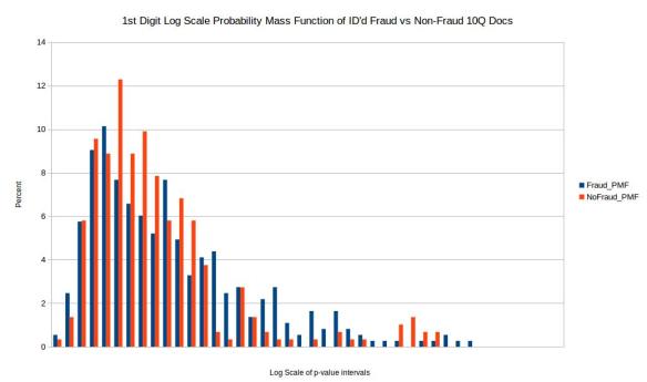
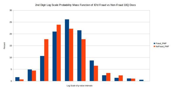
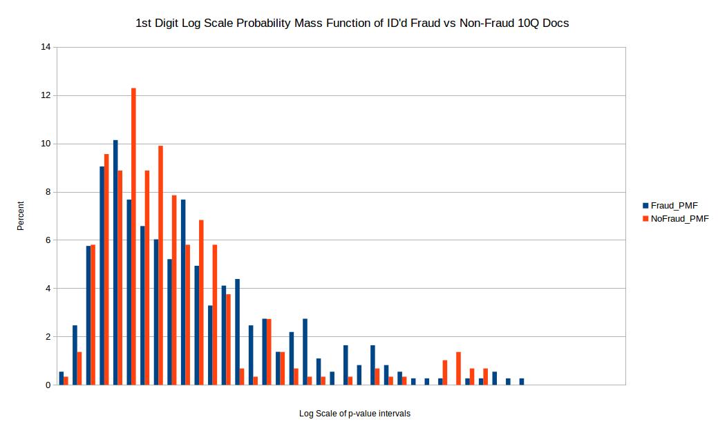
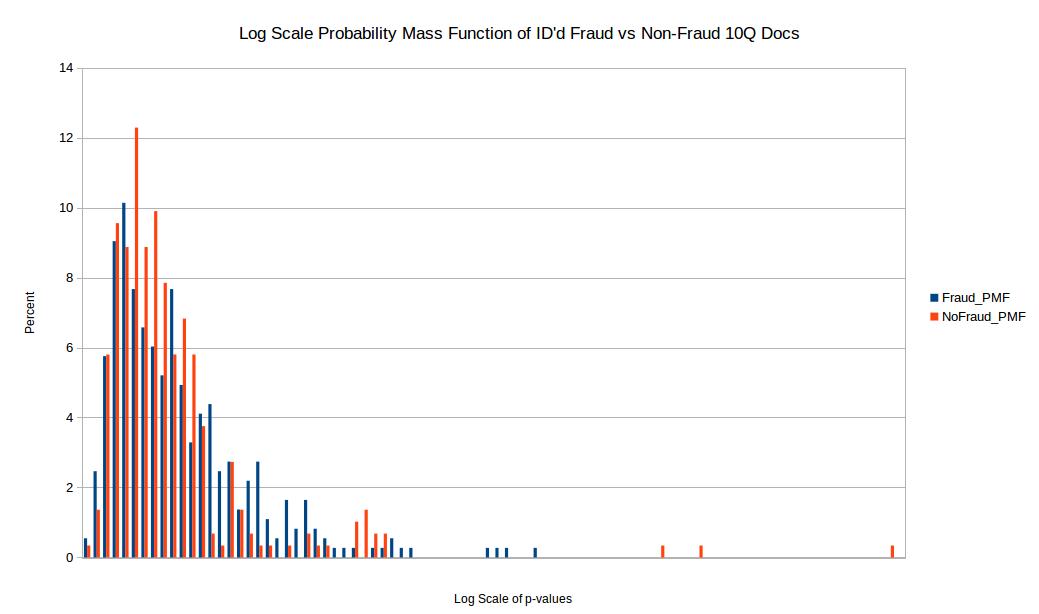
Before comparing the two samples I first eliminated p-values where the quantity of valid numbers within each filing were below 100 in order to eliminate any bias from small quantities of numbers in each filing. In order to compare the distribution of p-values for the chi squared comparison test I took a log scale base 10 of the p-values for both test and training set. I then setup intervals of 0, -0.5, -1, -1.5 all the way to -42 in order to create a probability mass function or PMF. The reason I wanted to do a PMF is because when directly comparing two distributions one should not compare histograms directly if the sample size for both samples are not exactly the same (which is often not the case). So to make up for this I took the percentage within each log base 10 range (0.5 increments) and created a PMF as seen above. Unfortunately the results come back pretty inconclusive. I would have hoped for two distinct and easily separable distributions however these results don’t visibly show that.

Conclusion
While Benford’s law is very powerful it may not be appropriate for 10Q documents. For one the algorithm works better on raw values and many of the values in the 10Q documents may be sums or output that resulted from operations on raw values. I think that Benford’s would work better on raw accounting logs that have more transaction data. Also I ran into a lot of numerical data points in 10Q files that were merely rounded estimates. I did my best to eliminate these in python. Finally Benford’s law works best when there is a wide range in the # digits.

Future
I think there is still potential to programatically analyze EDGAR files however 10Q files may not be close enough to the metal of company accounting necessary for the job. I am open to ideas though in the spirit of this analysis.

~Mr. Horn

D3.js

Screenshot from 2015-11-16 20:00:16

I’ve spend the past couple months working on various geospatial / prediction models. But this week I wanted to post an update on a side interest which is D3. I borrowed a book called D3.js in Action. So far it has been a lot of fundamental on how to utilize the DOM and D3 in combination and how to use the values in the DOM to influence the visualization. Why learn D3.js? Well it appears to be the next evolution in non-proprietary open source data visualization. While many data scientists probably just throw together a couple of plots in R or matplotlib in Python D3 serves a different purpose. Rather than generic plots or proprietary libraries I think D3 is meant to get root access to displaying data on the web. I have been extremely focused on geo-spatial the past couple of months and have looked at various mapping solutions like MapBox, CartoDB, Fusion Tables, etc.. just to name a few. What I like about D3.js is that while it may not be as polished for maps yet I think it is a library that will serve me long into my data career for more than just maps or bar charts. Data tool sets that will serve me 10 years from now are the tool sets that I invest my time in learning.

My Next Adventure at Renovate America

renovate
This week I am excited to be starting my next adventure at Renovate America as an Energy Analyst. Renovate America is most well known for their Home Energy Renovation Opportunity (HERO) program which utilizes Property Assessed Clean Energy (PACE) financing to fund energy and water efficiency upgrades in the house through property tax payments. One advantage of this means of renewable financing is that the payments on the solar panel, HVAC, artificial turf, or other upgrade is transferable to the next homeowner because they will resume payments via the property taxes. Renovate America creates software, analysis solutions, and relationships with local governance to streamline this financing innovation. Renovate America is tackling the challenge of aligning the interests of the homeowner who wants to save energy and water, the contractor who needs to operate efficiently and provide excellent service, and the local jurisdiction who needs to reduce carbon emissions using justifiable metrics. Renovate America has demonstrated a formula that aligns these three interests and encourages consumer protection, approved contractor project streamlining, and meets local governance greenhouse gas reductions. One of the reasons I am excited to join Renovate America is that they are utilizing agile and iterative software development methods (SCRUM) to serve customer more effectively. I am a big believer in involving the end user in the development process very early on and am excited for a world of new learning at Renovate America.

Creating the World’s Most Accurate Solar Rate Analyzer

GBPVWattsOpenEI

Over the past two months I have been working on and launched the world’s most accurate solar rate analyzer. It was featured by the ex-CTO of the White House and received some excellent press. You can play with the Solar Residential Rate Analyzer here. What makes this application novel is that it combines three really tough pieces of assessing solar payback. I combined Green Button Data, PVWatts, and Open EI’s Utility Rate Database into a single application to allow prospective solar customers to type in their address, upload their green button data, size their solar system, and see their new utility bill after solar. Below are the explanations of these three parts.

1) How much energy does your house consume?
If you were to receive an estimate from a contractor on your payback the best they could do is ask for your monthly bill and maybe give you an estimate of what you might be shaving off. The problem here is that even the more sophisticated contractors won’t even go that in depth and you will most likely get a generalized estimate of how much you will save. Here in lies Green Button Data. Green Button Data is an international standard that utilities voluntarily participate in allowing customers the ability to access their hourly smart meter data and grant access to that hourly consumption data as far back as 13 months. Also instead of downloading the data in a green button file format customers can also use Green Button Connect, an initiative that the three major IOUs in California have adopted already, to a validated third party to access this hourly data in perpetuity (or as long as the customer lives there). Here is a link to the Green Button Initiative and all the utilities currently supporting or pledging to support the standard.

2) How much solar insolation is available at your house?
If your home is the desert of Anza Borrego or the fogy mornings of San Francisco Bay the amount of solar insolation or solar resource available will vary. Fortunately the good folks at the National Renewable Energy Lab (NREL) have developed an API to calculate the amount of solar insolation and hourly AC productionof your solar panel given a few parameters including the latitude and longitude (or address), azimuth and tilt of the solar panel, and system size. This makes for an incredibly powerful and convenient method of calculating hourly kwh production. Here is a link to the NREL PVWATTs API.

3) I get it solar chips away at my net consumption. I still have no idea how this translates into my monthly utility bill.
Lets start with basics first, the typical default utility rate structure is a tiered rate structure where if you use more than X kwh allotted to you in that month you get bumped into Tier 2 where it cost more per kwh than in Tier 1. So if your house is an energy guzzler with air conditioning and a pool pump and you are in tier 4 getting charged at 32 cents a kwh it would be in your interests to shave off enough of your consumption to get back into Tier 2 where you might be getting charged 18 cents per kwh. The US has a lot of utilities that range from investor owned, to COOPs, to Municipality owned. Each one has their own unique surcharges, unbundled rates, and they update these rates almost every month often unpredictably. The DOE has recently given it stamp of approval to Open Energy Information’s (Open EI) Utility Rates Database API. This is an incredible service available to the public operated and run by Dr. David Loomis at Illinois State University. It allows one to access the the rate structure and tariffs of almost every utility in the U.S through their API. The API is very flexible in that it allows one to digest Time of Use, Tiered, and Tiered Time of Use date in a matrix format that accounts for differences in weekends and weekdays.


Behavior, Energy, and Climate Change Conference: 2014

BECC_Poseter

Over December I had the distinct honor of flying to Washington D.C. and attending the 2014 Behavior, Energy, And Climate Change Conference. I was able to see lots of presentations on the latest analytics taking place in energy and energy efficiency. I was also able to present my poster above on the results of my latest project using Green Button Data to ascertain if electric vehicle customers are really saving money by going electric and potential barriers. Green Button Data is a file format that lets one easily go to their corresponding utility webpage and download their hourly or 15 minute energy usage profile. Using these files from electric vehicle customers from PG&E, SCE, and SDG&E I was able to ascertain that about 60% of these customers were on a higher cost tiered tariff instead of opting for the lower cost “Time of Use” option. Time of Use charges a customer based on the time that the energy was consumed. For example if the energy was consumed at midnight the demand is much less and the cost becomes much cheaper than during peak hours. This 60% base of customers paying more amounts to an extra cost of $800 a year per EV Customer and all the customer had to do was call their utility and ask to switch. Keep in mind that this is $800 a year extra, over the lifetime of the vehicle that could easily become $12,000 total lost simply by not calling your utility. This adds up to roughly 30 million dollars a year that California EV Customers are leaving on the table based on current EV ownership statistics. In order to realize full savings electric vehicle customers need a seamless method to not only purchase and charge their new electric vehicles but also make the upfront decision of switching to a more optimal electricity rate (AKA electric tariff).

Christmas Tour of the White House
BECC_DC

Coursera Data Science Certificate: Update 1

johnhop
For the past four months I have been working on the Verified Data Science Certificate offered by John Hopkins University in conjunction with Coursera. I have so far completed the Data Scientist’s Toolbox, R Programming, and Getting and Cleaning Data. Here is my opinion so far on the ease, applicability, and relevance of these 3 courses (there are 9 total + a capstone project).

The Data Scientist’s Toolbox is very informative and can bring someone up to speed on using Git, citing data, etc.. For my I have already been accustomed to Git and Github so this first course was relatively easy.

R Programming I found to be very informative and the homework was definitely rigorous. Even though I have been using R since my first grad school class at Stanford in Advanced Statistics I found that I could be doing things to make my life easier and that I could be using apply, lapply, and tapply a lot more in my code rather than for loops. I felt this was a great module even for someone who has been using R for 3 years+.

Getting and Cleaning Data as instructive in connecting to a web site and downloading data pro-grammatically or through an API. How to clean, sort, and pre-process that data and also how to take advantage of R’s Data Tables. I have often used Data Frames and was not aware of the compute time advantages of using Data Tables especially for large data sets.

For just $50/course I think this is one of the best cost/value certificates one can do for Data Science. Of course there is University of Washington’s Online Data Science Certificate which may carry more prestige but I think this is a great investment none the less for someone looking for value in their Data Science Training.

Here are links to my certificates so far:

The Data Scientist’s Toolbox
R Programming
Getting and Cleaning Data


Back to Basics: Data Science Applied and Theoretical

datasci
One of the awesome data prediction projects I had the privilege of working on as of late is helping the Department of Energy and Lawrence Berkeley National Laboratory improve their Home Energy Score (HES). This single value metric which ranges from 1 – 10 judges the performance of the energy efficiency of a given home regardless of user behavior. In other words this scoring system allows new home buyers to look at household energy performance based on this score without having to take into account the prior users’ behavior. HES is a relatively simple scoring system compared to the California Home Energy Rating System (HERS). I needed to conduct predictive analysis based on the HES features to predict HERS outcomes and find out if the simpler HES model captures the variability of the more complex HERS model.

Click below to see the Home Energy Score Viability Report
Home Energy Score Predictive Analysis

I ended up using Multi-variate Linear Regression, Random Forest, and Support Vector Machines using a repeated 10-fold cross-validation as my resampling method. I read up on the book “Applied Predictive Modeling” and gained more appreciation for the importance of pre-processing. Why the skew of the distribution matters for model A, why multicolinearity can hamper multi-variate regression but not decision trees. I also expanded my modeling toolbox to include more complex methods including Support Vector Machines (SVM) and single layer neural networks.

I highly recommend Applied Predictive Modeling and see the link below:

Applied Predictive Modeling – by Max Kuhn and Kjell Johnson

Other interesting books I’ve been reading lately:

Doing Data Science – Straight Talk From The Frontline – by Cathy O’Neil and Rachel Schutt

Programming – Collective Intelligence – by Toby Seagran

Data Analysis Using Regression and Multilevel/Hierarchical Models – by Andrew Gelman and Jennifer Hill

Great Books on agile production, work culture, leadership, and entrepreneurial management

franklinLincolnkimberly
For the past two months I have continued to learn and focus mainly on Javascript to produce applications quickly. However all this time spent on production and fine details made me want to take a few steps back and improve myself from a higher frame of reference, namely best practices for managing high risk projects where the customers, means, and goals can change rapidly. The reason I felt the urge to better understand project management and development from an agile side is that I am very self-motivated. I wanted to understand how self-motivated technical workers fit into a world where project management techniques are changing. After reading these books my opinion is now changing on what the role of project management is.

I wanted to know the qualities that make a great leader and how those leaders arrived there. The book Lean Startup by Eric Ries has taught me that small dynamic projects should use data to validate the direction and progress of projects as the project is developing. In other words don’t plan steps 1 through 10 and use the deliverable date as the metric of success. One can deliver a poor product that no one uses on time and according to spec all the while feeling incredibly productive. Instead launch the product after step 3, gain feedback from the audience, see if there is traction, and don’t worry about negative opinion or reputation. You might find yourself changing direction based on the feedback and save yourself the time of working through steps 4- 10. Another great book that I took a lot from is the book Good to Great. This book was written in 2005 and studied companies from the 1970s to 2000s but it still applies today now more than ever. The point I took from this book is that before you strategize or rethink the direction of the company get the right people in the right positions. In other words before deciding where to steer the bus get the right people on the bus. The right people always come first. I took my time selecting these books and I would recommend all of them.

My opinion is that every male manager should read Lean In. I’m not necessarily saying that Sheryl Sandberg offers sage advice to women because not all women had the early opportunities that Sheryl Sandberg had including Harvard, etc..It is my opinion however that managers have the creative power to engineer their companies work culture and before digging the foundation and laying the scaffold of that culture one must ask first who will be living in that culture and would I want to live there. I think Delivering Happiness by Tony Hsieh compliments Lean In because it focuses on Culture and how that culture helped Zappos go from a nearly bankrupt online company to the number one online shoe sales company and more importantly customer service company.

I must admit when I first saw the title How to Win Friends and Influence People I thought this book sounded shallow in intent and against every grain of my morality. Why would anyone study how to interact with people in order to get what they want. I think this book should create a second edition and just change the title to “How to Communicate Humbly and Effectively” and it would attract more introverts who might be misled by the title. Nonetheless this book opened my eyes on how our countries greatest leaders from Abraham Lincoln to Benjamin Franklin would fail and fail at debating and one day decided to empathize with their constituents. To instead say “you know in your shoes I understand how you would come to that position especially since …” “I think that you are right given the assumption that ….” “My only question is this, and forgive me I may be wrong”. I think it is important to posit an idea in a way that allows and invites others to still add in their thoughts without shutting the doors by using the right words.

The last man in the pictures above, I bet you don’t know who that is. That man is Darwin E. Smith one of the world’s greatest entrepreneurs who transitioned Kimberly Clark from a good company to a great company. Ask any MBA who their favorite entrepreneur is and they will mention Steve Jobs, Bill Gates, or Elon Musk. Ask them what they think of Darwin E. Smith and they’ll stare at you blinking. Darwin E. Smith took the reigns of a company that was in the business of paper mills. After battling cancer, given a few months, and working for another 20 years as CEO he came to the idea that one must chop ones arm off if that is what it takes to live. So as the paper milling business was making marginal income he decided to sell all of the mills to the criticism of the board and went on to reinvest that capital into consumer paper products such as Huggies, Kleenex, Kotex, Depend etc… The point being that cutting off non-productive business is just as, if not more important than creating new business. The biggest take away for me from Good to Great is that some of the worlds greatest leaders are those that no one ever recalls hearing about in the media. Leaders who don’t boast, brag, or take credit for their achievements. In fact Good to Great studied over 1400 companies and found a negative correlation between a CEO bragging and boasting about him or herself and the outcome of that company. Great leaders at great companies build and recruit a team so strong that when that great leader eventually leaves the company someone equally or more capable is there to continue where they left off.

Rework by Jason Fried and David Hansson
Delivering Happiness by Tony Hsieh (Founder of Zappos)
Good to Great: Why Some Companies make the Leap by Jim Collins
The Lean Startup: How Today’s Entrepreneurs Use Continuous Innovation to Create Radically Successful Businessess by Eric Ries
How to Win Friends and Influence People by Dale Carnegie
Lean In for Graduates by Sheryl Sandberg